Layering Pigments on Textured Paper: Controlled Edges and Bloom
Layering Pigments on Textured Paper: Controlled Edges and Bloom
This note compares a few modest approaches to layering on textured paper and records the small differences I observed. The experiments set out to probe three variables: the paper’s surface texture, the amount of pigment and binder in the wash, and the wetness of the receiving layer. Rather than giving rules, the goal is to offer a few reproducible observations you can apply and adapt.
Materials and quick setup
- Three papers: rough cold-press 300gsm, medium cold-press 300gsm, hot-pressed 300gsm.
- Two pigments: a staining blue and a non-staining earth colour.
- Brushes of similar size; consistent water containers and blotting paper.
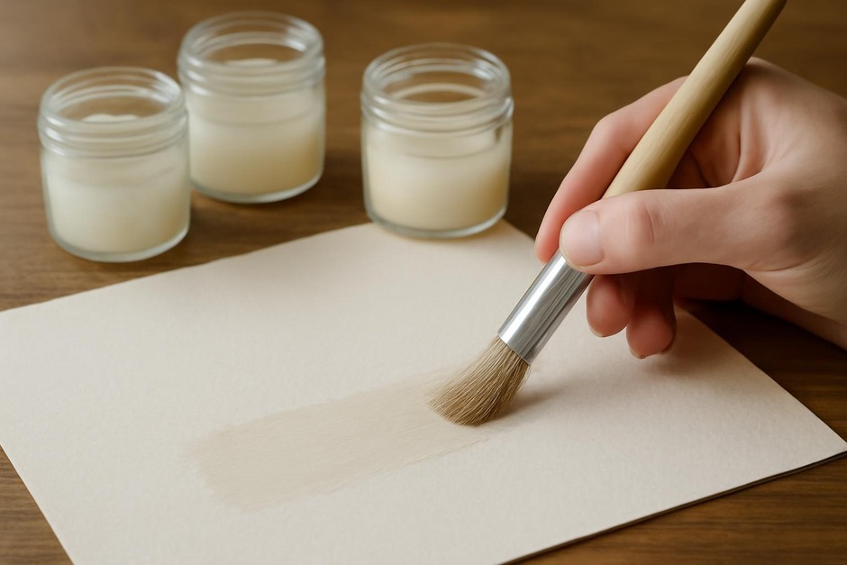
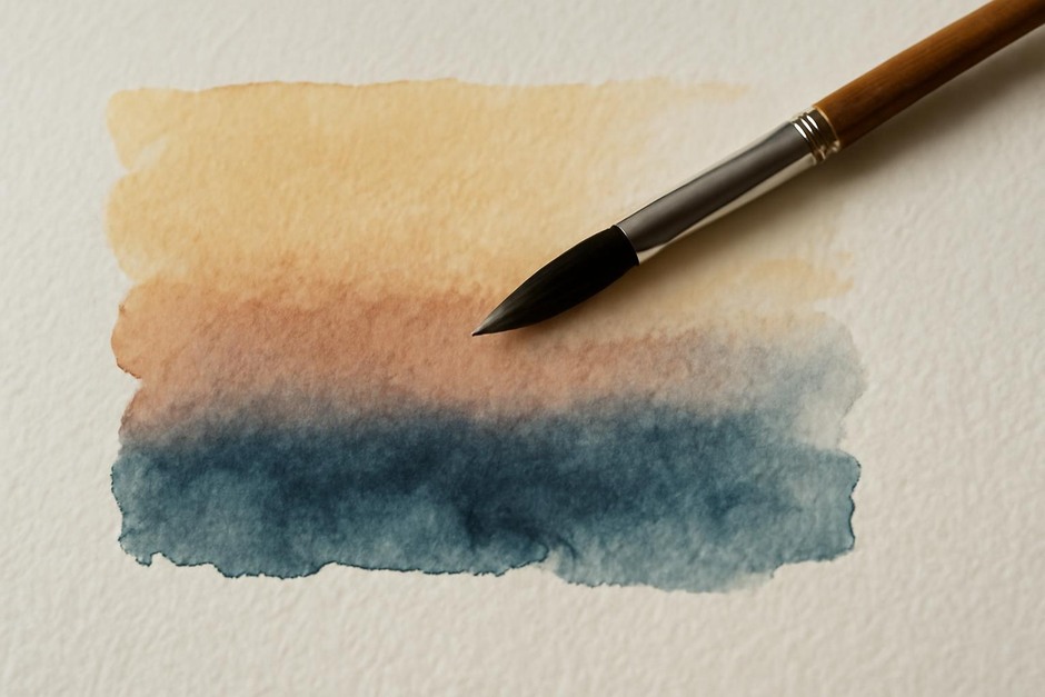
Each test began with a simple wash laid down on paper allowed to settle for intervals of 30 seconds, two minutes, and five minutes before a second wash was applied. The second wash varied in pigment concentration and wetness.
Observations about edges and bloom
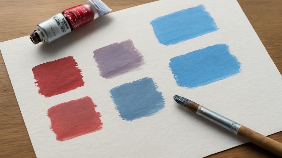
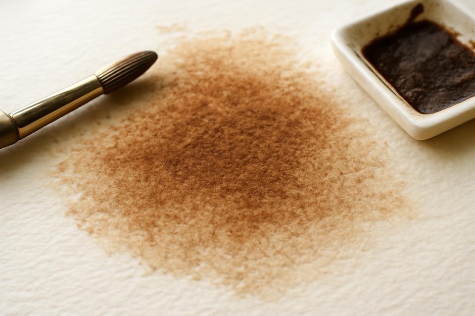
On the rough cold-press sheet, pigment tended to pool in the hollows of the surface. When the receiving layer was still visibly wet, the second wash produced soft, irregular edges and occasional blooms where pigment bypassed the drier top paper fibres and accumulated in a pocket. The blooms were more pronounced with heavier pigment loads and with staining pigments that were less likely to lift.
The medium cold-press surface showed a balance: some textural capture, but fewer pronounced blooms. Edges softened predictably when the base layer was wet, and a light touch with a damp brush could nudge the edge toward a desirable gradation. Heavier pigment loading increased granulation effects in the earth colour but did not cause as many blooms as on the rougher sheet.
The hot-pressed paper held the cleanest edges. Because the surface has less pronounced tooth, washes behave more like films and are less prone to sudden pooling. Blooms were rare; when they occurred, it was often because an unusually heavy pigment-laden drop hit a thinly sized area.
About pigment load and binder
Pigment concentration changed the game. Heavier loads delivered richer colour and more obvious granulation in pigments prone to settling, but they also increased the tendency to create sharp boundaries when the receiving layer was only slightly damp. Dilute washes blend more readily and give the painter more time to control transitions.
Binder content matters too. A slightly richer binder percentage kept particles more suspended, which reduced grainy pooling but made the wash behave more like a continuous film. That film-like quality interacted well with less textured papers and helped produce clean glazes.
Practical takeaways to try
- For deliberate soft edges on textured paper: apply a denser wash, wait 30–60 seconds, then apply a fairly wet, dilute second wash to the joining area.
- To avoid undesired blooms on rough papers: work with lower pigment concentration and blot excess water from the receiving layer before glazing.
- When you want a crisp overlay: use a smoother paper and let the base wash dry longer; a fine glaze with low water will sit more cleanly.
These are modest experiments with predictable trade-offs: texture invites unexpected pooling but rewards tactile interest; smooth papers make for control at the expense of surface character. The studio value comes from repeating the same test with your own pigment set and brushes. Small differences in pigment tinting strength or particle size will alter the results, so think of these observations as starting suggestions rather than universal laws.