Limited Palette Notes for Urban Sketching: Paper and Pigment Pairings
Limited Palette Notes for Urban Sketching: Paper and Pigment Pairings
This studio note compares a few limited palette approaches for quick urban sketching and pairs them with small paper formats. The aim is practical: which small combinations give flexible, travel-ready mixes that respond predictably on common sketchbook papers.
Format and materials
- Sketchbooks: cold-press 200gsm spiral sketchbook, hot-press 160gsm travel pad, and a heavy paper concertina 300gsm for studies requiring more water.
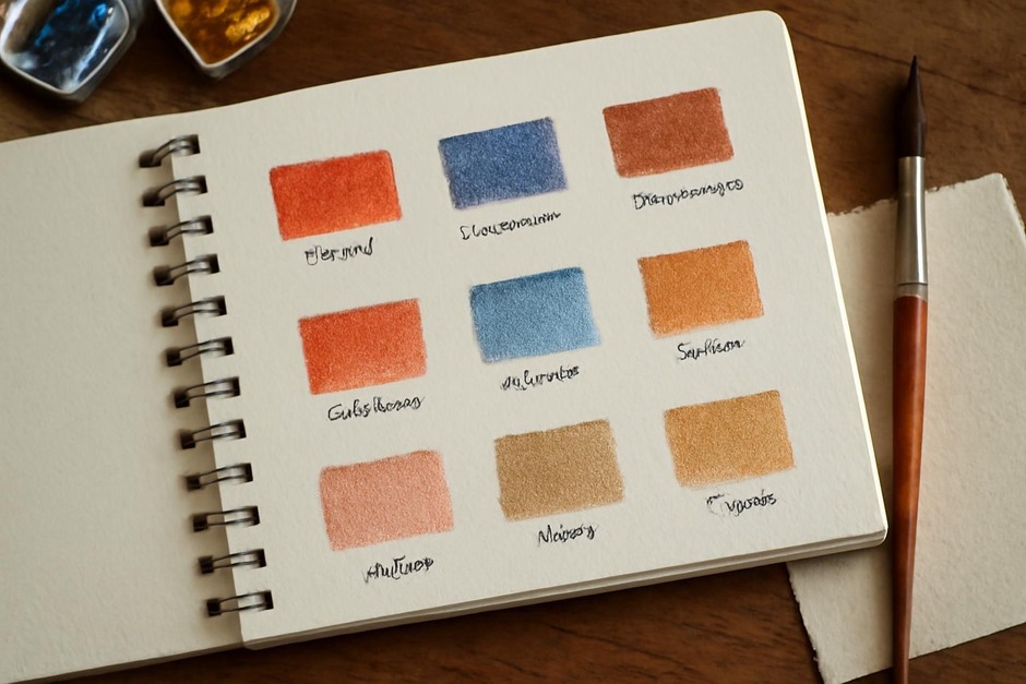
- Palettes tested: ultramarine or cool blue, a warm red, and a neutral earth or yellow ochre; plus a separate neutral grey option.
- Tools: compact brush, small water container and sponge, a limited amount of paper towel for blotting.
Each palette was evaluated for mixing range, speed of drying, and how it behaved on different paper surfaces during quick studies.
Blue, red, earth trio
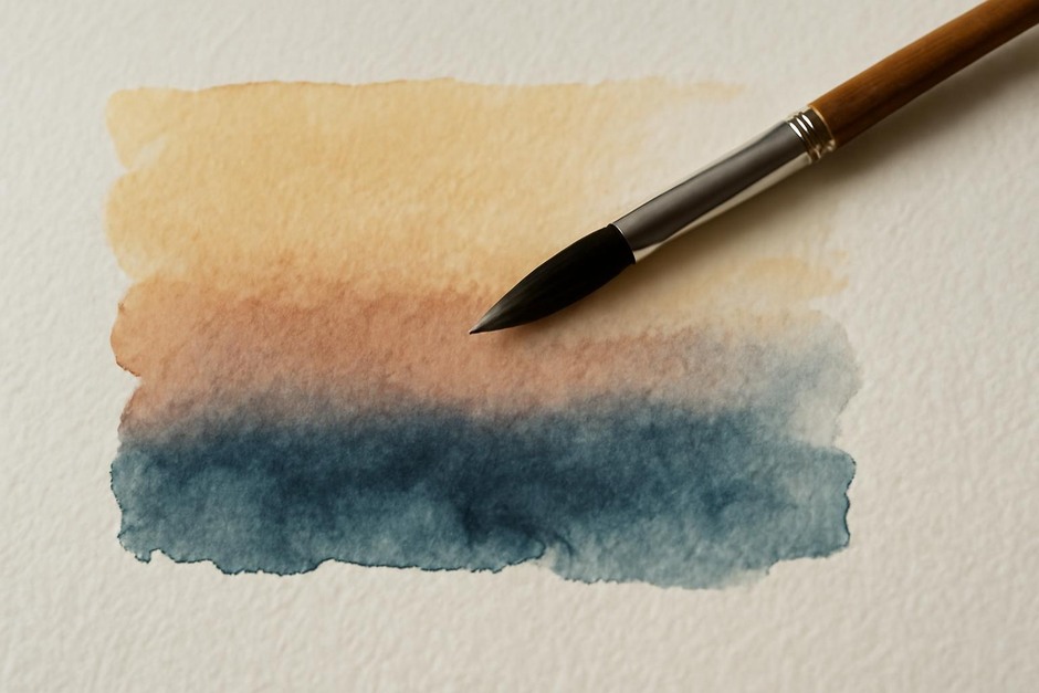
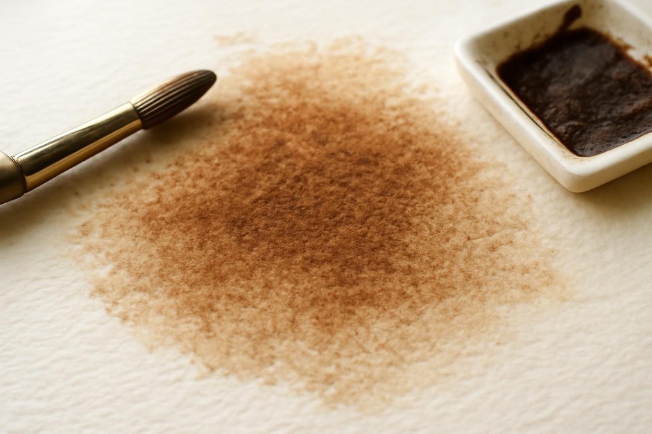
This classic trio yields a wide range of warm and cool neutrals. On the cold-press sketchbook, washes mixed cleanly but dried with more texture than on the hot-press pad. The heavy concertina allowed bolder washes with fewer visible fibres and better lifting when reworking was necessary.
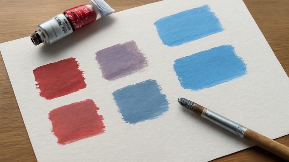
Mixing small amounts of the warm red with blue produced nuanced grays and muted purples useful for shadowed building faces. The earth provided quick tonal work and warmed mixes without saturating them. On the hot-press pad, small glazes read with greater clarity and were useful for rapid layering.
Blue, yellow ochre, and neutral grey
Swapping warm red for yellow ochre yields a cooler, more restrained kit. The palette is efficient for daylight studies and produces natural shadow grays when blue and ochre are combined. The hot-press pad favored crisp line and swift glazing, while the cold-press sketchbook gave textured skies a pleasing grain.
Practical travel notes
- For speed and portability: choose a paper that handles brief wet passes without excessive buckling; 200–300gsm is a common balance.
- Keep one neutral on the palette to avoid overmixing; a small pan of neutral gray or a neutral earth lets you control contrast without muddying colours.
- Practice one quick test per paper on location to know how much water and pigment loading to expect under real conditions.
These notes emphasize that the synergy between pigments and paper matters most when working quickly. The same palette will feel different on a textured cold-press page than on a slick hot-press surface. With a limited kit, tests that mirror real sketching conditions—short time, single-pass gestures, quick drying—reveal the most useful pairings for future outings.